Pantone Color of the Year 2018 - Ultra Violet

Here at Ciseal we’re big fans of bright, bold colors. When Pantone Universe revealed the Pantone Color of the Year - Ultra Violet (Pantone-18-3838) we were ecstatic. Ultra Violet is a bright, bold statement that represents individuality, counterculture, and mindfulness. It’s a color of visionaries and energizes and empowers a brighter future.
We couldn’t wait to see all of the spaces and objects that would be adorned with this inspiring hue this year. Here’s a collection of ideas that use Ultra Violet to influence both the environment of things around us as well as the psychology within us. Be inspired to incorporate this bright, bold color or your favorite hue to make your home one of a kind!
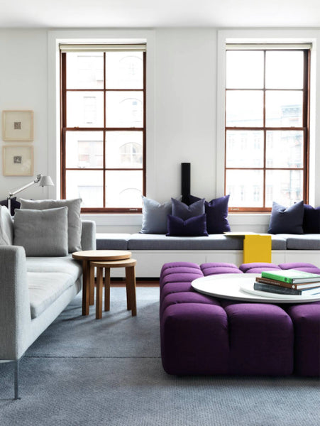
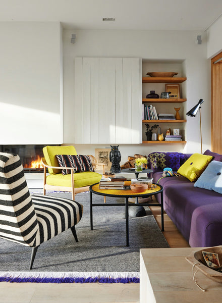
This room uses Ultra Violet to punch up an otherwise neutral space. Using a touch of yellow really helps bring it all together, too - it’s purple’s complementary color on the color wheel. An easy way to incorporate this technique is with a throw rug or pillows so you’re not committed to reupholstering a large piece if your taste changes.
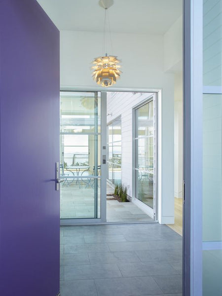
Don’t you just love a bright, jewel-toned front door? If Ultra Violet is your jam, then it’s the perfect hue to set the tone for your home. And a bonus for it happening to be the color of the year? It’s so much easier to find on everything from paint to furnishings.
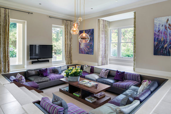
You guys! We have a conversation pit! We love it when these Midcentury relics make a comeback. This conversation pit has a trendy Ultra Violet upgrade, but the relatively small doses of the bright color keep it restrained.
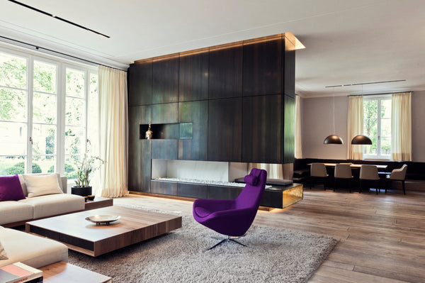
Check out the bold statement this Ultra Violet chair makes in an otherwise neutral room. In the right dose, it’s the perfect jewel tone that plays well with neutrals without overwhelming the room.
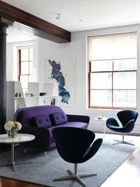
I love how Ultra Violet takes on a moody vibe in this room. That’s thanks to the light quality of the room. Ultra Violet is a color that will appear slightly different depending on the type of lighting that’s in the room - this room has some lovely indirect sunlight that gives Ultra Violet an almost neutral, navy blue look.
Do you see that fringe on the rug? That’s such a subtle way to add Ultra Violet to a room, and it’s still impactful. With a bold color like Ultra Violet, sometimes small doses are just enough.
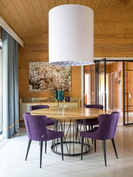
Ultra Violet is such a great counterpoint to knotty pine walls. Knotty pine takes on a yellow hue as it patinas which can be quite overwhelming when it’s all over the walls of a cabin. But when yellow’s complementary color - violet - is added to the room, it balances out perfectly.
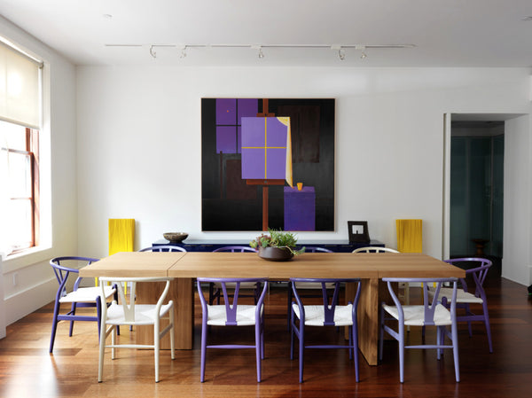
Using all of the hues of violet is such a great way to show your love for the color without it being too over the top. The otherwise neutral color scheme of warm white walls, oak floors, and natural linens really lets the purple shades shine.
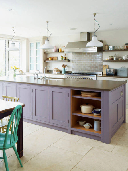
Last but not least, lets look at a softer take on Ultra Violet. While still an impact for sure, this cabinet hue is a bit easier on the eyes. This soft violet still carries that individualist, empowering nature, but with a slow and steady wins the race kind of vibe.


Nicole Hodsdon
Author